Mastering the Color Wheel: Your Guide to Minimalist Harmony
Understanding the Color Wheel: Your Foundation
Color is the heartbeat of design, and in minimalist style, it plays a pivotal role in creating a serene yet striking environment. By understanding the color wheel, you can navigate the complexities of color coordination with ease. The color wheel is not just a tool; it’s your guide to achieving harmony in your minimalist space.
Primary, Secondary, and Tertiary Colors are the three main categories that form the backbone of the color wheel. Primary colors—red, blue, and yellow—are the building blocks of all other colors. Mixing these creates secondary colors like green, orange, and purple. Tertiary colors arise from blending a primary with a secondary, offering endless possibilities.
Creating a Minimalist Palette: Less is More
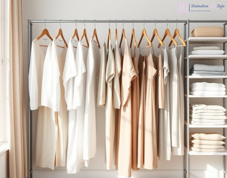
When it comes to minimalist style, simplicity is key. A well-chosen color palette can elevate your space without overwhelming it. The goal is to create a cohesive look that is both calming and aesthetically pleasing.
To achieve this, consider the following approach:
- Choose a Dominant Color: This will set the tone for your space.
- Select Complementary Colors: These should enhance, not compete with the dominant color.
- Incorporate Neutrals: Whites, grays, and beiges can help balance and ground your palette.
By focusing on a limited number of colors, you ensure that your minimalist design remains uncluttered and harmonious.
Color Coordination: The Minimalist Approach
Color coordination in a minimalist style goes beyond mere aesthetics; it’s about evoking emotions and creating an atmosphere. Here’s a simple breakdown of effective coordination strategies:
| Color Strategy | Description |
|---|---|
| Monochromatic | Utilizes variations of a single color, creating depth through shades and tints. |
| Analogous | Combines colors that are next to each other on the color wheel for a harmonious look. |
| Complementary | Pairs colors opposite each other on the wheel, bringing energy and contrast. |
Each strategy can significantly impact the overall feel of your space. By using these techniques, you will not only master color coordination but also achieve a stunning minimalist aesthetic that resonates with tranquility and style.
The Psychology of Color: Evoking Emotions in Minimalism
In the realm of minimalist design, color is not merely an aesthetic choice; it is a profound element that can shape emotions and experiences within a space. Understanding the psychological impact of colors is crucial for anyone looking to create a minimalist environment that resonates with tranquility and purpose. Colors can invoke feelings that range from serenity to excitement, and selecting the right hues can transform a simple space into a sanctuary of calm or a hub of creativity.
When you delve into the psychology behind colors, it becomes clear how specific shades can influence mood and perception. For example, cool tones like blues and greens are often associated with calmness and relaxation. These colors can help to create a soothing atmosphere in a minimalist setting, perfect for areas meant for unwinding, such as bedrooms or meditation spaces. Meanwhile, warm hues like yellows and oranges can inject energy and vibrancy into a room, making them ideal for social areas like kitchens or living rooms. Understanding these emotional connections allows you to curate a space that not only looks good but feels good as well.
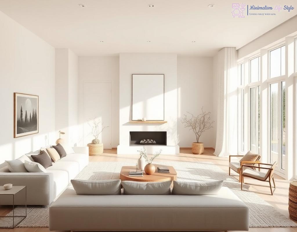
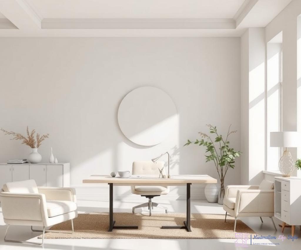
Moreover, the use of neutral colors in minimalist design plays a pivotal role in emotional evocation. Shades like whites, grays, and beiges serve as a blank canvas, promoting a sense of peace and simplicity. They allow other colors to shine without overwhelming the senses. By integrating these calming neutrals with carefully chosen accent colors, you can achieve not just a stylish look, but also an emotional narrative that unfolds within your space.
As you explore the art of color coordination in minimalist design, consider how you want your space to feel. Are you aiming for a peaceful retreat or a stimulating environment? The answer will guide your color choices and help you master the delicate balance of emotional resonance and aesthetic appeal. Ultimately, by tapping into the psychology of color, you can enhance the minimalist philosophy of ‘less is more’ and create a space that reflects both beauty and emotion.
Textures and Tones: Enhancing Minimalist Spaces with Color
Bringing Depth with Textures
In the realm of minimalist design, the interplay of textures and colors can significantly elevate the aesthetic appeal of a space. While minimalist spaces often embrace simplicity, introducing a variety of textures can create depth and intrigue without compromising the essence of minimalism. Imagine a room where soft linen curtains gently frame a large window, allowing natural light to spill in, contrasting beautifully with the smooth, sleek finish of a concrete floor. This careful selection of materials not only adds layers to the visual narrative but also enhances the overall experience of the space.
Furthermore, consider how the tactile quality of different surfaces interacts with the chosen color palette. A soft, muted color can feel much warmer when paired with a tactile fabric, such as velvet or a knitted throw. By incorporating textures that resonate with your color choices, you can achieve a harmonious balance that draws the eye and invites touch, making the space feel alive and engaging.
The Power of Tones in Color Coordination
When discussing color in minimalist design, it’s essential to recognize the role of tones—the subtleties that can either harmonize or disrupt a space. Utilizing a range of tones within your selected color palette allows for a rich, layered look that maintains the minimalist ethos. For instance, if your dominant color is a serene blue, consider incorporating various tones of blue, which can range from a pale sky to a deep navy. This gradation can create a sophisticated and cohesive environment while remaining true to the principles of minimalism.
Additionally, the application of tones can influence the mood of a room greatly. Lighter tones can enhance feelings of openness and airiness, making spaces appear larger and more inviting. In contrast, deeper tones can provide a sense of intimacy and warmth, perfect for creating cozy corners in larger rooms. The strategic use of tones not only brings visual interest but also fosters an emotional connection to the space.
Accent Colors: Making Bold Statements in a Subtle Way
In the realm of minimalist design, where the mantra ‘less is more’ reigns supreme, the strategic use of accent colors emerges as a powerful tool. These vibrant hues can infuse personality and energy into a space, transforming it from a simple canvas into an expressive work of art. By carefully selecting and placing accent colors, you can create focal points that draw the eye and evoke emotions without overwhelming the minimalist ethos.
Choosing the Right Accent Colors
The first step in making bold statements through accent colors lies in understanding the overall color scheme of your space. Consider the existing palette—are you leaning more towards cool tones or warm hues? For instance, if your dominant color is a soft gray, introducing a bright mustard yellow as an accent can create a striking contrast that invigorates the room. Conversely, if your base is a tranquil blue, a rich coral can provide a lively pop that feels both refreshing and harmonious.
It’s essential to remember that the effectiveness of an accent color is heightened when it is employed sparingly. A single piece of art, a decorative pillow, or a vibrant vase can serve as a focal point, capturing attention while maintaining the minimalist aesthetic. This approach ensures that the accent color does not compete with the overall design but rather complements it, allowing each element to shine.
The Impact of Placement and Proportion
Beyond color selection, the placement and proportion of accent colors play a crucial role in their effectiveness. Strategically positioning accent colors in areas where the eye naturally gravitates can enhance the visual flow of the space. For example, a bold red chair in a neutral living room can become a conversation starter, drawing people in and encouraging interaction.
Moreover, considering the proportion of your accent colors is essential. A well-balanced approach might involve using larger accents in open spaces while reserving smaller, subtler accents for more intimate areas. This not only creates a sense of cohesion but also allows for a dynamic interplay between the minimalist backdrop and the vibrant accents, reinforcing the principle that even the slightest addition can make a significant impact.
In conclusion, mastering the art of accent colors in minimalist design is about striking a balance between boldness and restraint. By thoughtfully selecting and placing these colors, you can create an environment that is both visually captivating and emotionally resonant, proving that in the world of minimalism, subtlety can indeed make the loudest statements.
Seasonal Shifts: Adapting Color Coordination in Minimalist Design
As the seasons change, so too should our approach to color coordination in minimalist design. Embracing the natural transformations occurring outside can significantly enhance the ambiance of your living space. By adapting your color palette to reflect the seasonal shifts, you not only maintain a fresh aesthetic but also create an environment that resonates with the world around you.
Spring Awakening: Infusing Freshness
Spring is a time of renewal and vibrancy, making it the perfect season to introduce lighter hues and playful accents into your minimalist space. Picture soft pastels like mint green, blush pink, and sky blue, which can breathe life into your home. These colors evoke feelings of freshness and growth, aligning beautifully with the blossoming flora outside.
Incorporating natural elements, such as floral patterns in throw pillows or a vase of fresh flowers, can enhance the warmth of the season. This harmonious blend of color and nature creates a welcoming atmosphere, encouraging you to embrace the beauty of spring.
Summer Radiance: Embracing Boldness
As summer arrives, so does a burst of energy and vibrancy. This is the time to experiment with bolder colors like sunny yellows, vibrant oranges, and lively coral. These hues can evoke feelings of joy and positivity while keeping the minimalist design intact.
Consider using these brighter shades as accent colors against a neutral backdrop. A striking piece of art or a statement furniture item can serve as a focal point, drawing the eye and radiating warmth. It’s essential, however, to maintain a balance—too many vibrant colors can overwhelm the senses, so choosing one or two accent colors will keep the minimalist ethos alive.
Autumn Elegance: Cultivating Warmth
With the arrival of autumn, the landscape transforms into a tapestry of rich, warm colors. This is the ideal moment to incorporate deeper tones like burnt orange, mustard yellow, and earthy browns into your color palette. These colors not only reflect the changing leaves but also add a layer of coziness to your minimalist design.
Layering textures, such as soft wool throws or velvet cushions, can enhance the warmth and comfort associated with autumn. By strategically placing these elements, you create a snug environment that invites relaxation and reflection.
Winter Serenity: Finding Calm
Winter often calls for a retreat into warmth and tranquility. Embrace a color palette of cool blues, soft grays, and crisp whites, echoing the serene beauty of a winter landscape. These shades evoke peace and calm, perfect for creating a cozy sanctuary amidst the chill.
Incorporating natural textures, like a plush area rug or heavy drapes, can add warmth and softness, contrasting beautifully with the cooler color tones. This combination will not only keep your space visually appealing but also emotionally comforting during the colder months.
Seasonal Color Coordination: A Summary
To help you navigate the seasonal shifts in your color coordination, here’s a quick reference list:
- Spring: Soft pastels and floral patterns for freshness.
- Summer: Bold colors and vibrant accents for energy.
- Autumn: Warm tones and cozy textures for comfort.
- Winter: Cool colors and layered textiles for serenity.
By consciously adapting your color choices with the seasons, you not only enhance the aesthetic appeal of your minimalist space but also create a harmonious connection with nature. This approach fosters an emotional resonance that makes your home a true reflection of the world outside.