
Identifying Key Financial Trends

In today’s fast-paced financial environment, staying informed about key trends is not just an advantage—it’s a necessity. Financial newsletters serve as a vital resource, but with a barrage of information available, how can we pinpoint the trends that truly matter? The answer lies in a strategic approach to curation, focusing on actionable insights rather than mere data points.
To effectively identify and track financial trends, one must look beyond the surface. The following indicators are crucial for discerning the health of the economy and the stock market:
- Market Volatility: A measure of price fluctuations that can indicate investor sentiment.
- Interest Rates: Changes can affect borrowing costs and consumer spending.
- Inflation Rates: Rising prices can erode purchasing power and influence investment strategies.
- Earnings Reports: Company performance can signal broader economic conditions.
- Consumer Confidence Index: Reflects the optimism of consumers regarding the economy and influences spending behaviors.
Once you’ve identified the key indicators, the next step is to analyze them effectively. Here are some strategies to streamline your analysis:
- Data Aggregation: Use tools and platforms that consolidate financial data and news from various sources for a comprehensive view.
- Visual Analytics: Utilize charts and graphs to visualize trends over time, making it easier to detect patterns.
- Peer Comparisons: Benchmark against industry peers to understand relative performance and potential opportunities.
By focusing on these aspects, you can ensure that your financial newsletter captures the essence of the trends that matter most, providing your readers with invaluable insights.
Crafting Compelling Newsletter Content

In the competitive world of financial newsletters, the quality of your content is paramount. To engage readers and keep them coming back, it’s essential to create content that not only informs but also resonates with their interests and concerns. This involves a careful balance of data, insights, and storytelling that transforms raw information into compelling narratives.
To begin with, understanding your audience is crucial. Recognizing their preferences allows you to tailor content that speaks directly to their needs. For instance, seasoned investors may appreciate in-depth analyses and forecasts, while novice readers might benefit more from simplified explanations of complex concepts. By segmenting your audience, you can deliver targeted content that enhances engagement.
One effective way to captivate your readers is through storytelling. Financial data, when presented without context, can seem dry and uninviting. However, weaving narratives around financial events or trends can bring these numbers to life. For example, instead of merely reporting on a company’s earnings, consider exploring the factors that led to those results. Highlight the human element—the challenges faced, the strategic decisions made, and the consequences that followed. This approach not only makes the content more relatable but also encourages readers to think critically about the information presented.
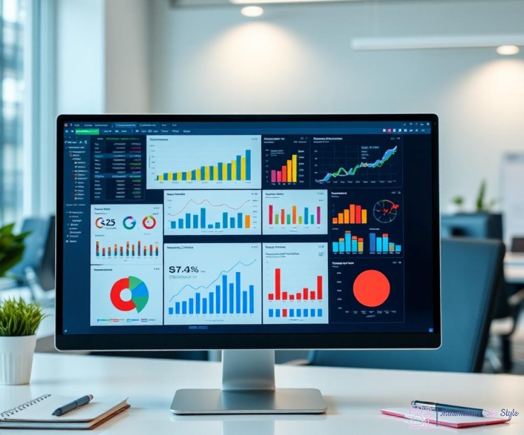
Incorporating visual elements such as charts, infographics, and tables can significantly enhance the readability of your newsletter. Visual aids help to break down complex data into digestible formats, allowing readers to grasp key points at a glance. For instance, a well-designed infographic summarizing market trends can provide a quick overview that complements your detailed analysis. Additionally, tables comparing different financial metrics can facilitate easier understanding of performance across sectors or companies.
Ultimately, the goal is to create a well-rounded narrative that combines rigorous financial analysis with engaging storytelling and effective visual communication. By focusing on these elements, your financial newsletter will not only inform but also inspire readers to take action based on the insights provided.
Utilizing Data Visualization Tools
In the realm of financial newsletters, the presentation of information can be just as crucial as the content itself. As readers are bombarded with data from multiple sources, the ability to distill complex information into clear, visually appealing formats becomes a key differentiator. Data visualization tools offer an innovative way to enhance understanding, enabling readers to absorb critical insights quickly and effectively.
Data visualization goes beyond mere aesthetics; it serves as a powerful method to communicate intricate financial concepts. Here are some of the most effective types of visual aids that can elevate your newsletter:
- Charts: Bar charts, line graphs, and pie charts can present trends and comparisons at a glance, making it easier for readers to interpret data over time.
- Infographics: These combine visuals and text to tell a story or explain a concept, allowing readers to grasp complex information in a simplified manner.
- Tables: Well-structured tables can organize data neatly, enabling side-by-side comparisons of financial metrics across different entities or time periods.
While using data visualization tools can significantly enhance your newsletter, it’s essential to follow best practices to ensure clarity and effectiveness:
- Keep it Simple: Overly complex visuals can confuse rather than clarify. Aim for simplicity and clarity in your designs.
- Highlight Key Takeaways: Use color and emphasis to draw attention to the most important data points, ensuring they stand out to your readers.
- Ensure Accessibility: Make sure your visuals are easy to read across devices, considering font sizes, color contrasts, and overall design.
To aid in selecting the right tools for your data presentations, consider the following comparison of popular data visualization platforms:
| Tool | Key Features | Best For |
|---|---|---|
| Tableau | Interactive dashboards, extensive data sources | In-depth analysis |
| Canva | User-friendly, templates for infographics | Quick visual content creation |
| Google Data Studio | Real-time data integration, collaboration | Team projects |
By strategically utilizing data visualization tools, your financial newsletter can not only inform but also engage your audience more effectively. The right visuals can transform dry data into compelling narratives, allowing readers to connect with the information on a deeper level.
Engaging Your Audience Effectively
In the digital age, where information is abundant yet attention spans are fleeting, capturing and retaining your audience’s interest is paramount. Financial newsletters must go beyond basic reporting to create a dynamic reading experience that resonates with the reader’s needs and preferences. This involves adopting innovative strategies that not only inform but also engage, transforming your newsletter into a go-to resource for financial insights.
One of the most effective ways to engage your audience is by offering personalized content tailored to their specific interests and investment styles. By segmenting your subscriber base according to their preferences—be it risk tolerance, investment goals, or even favorite sectors—you can curate articles and insights that speak directly to them. This personalized touch not only enhances relevance but also fosters a deeper connection between your readers and the content. Imagine a subscriber who primarily invests in technology stocks receiving a detailed analysis of market trends in that sector, alongside actionable tips; this targeted approach can significantly boost engagement and loyalty.
As readers increasingly seek active participation, incorporating interactive elements into your newsletter can greatly enhance engagement. Consider embedding polls, quizzes, or even interactive charts that allow your audience to manipulate data according to their interests. This kind of engagement turns passive readers into active participants, making them feel more invested in the content. For example, a poll on market sentiment regarding a recent economic event could not only provide you with valuable insights but also encourage readers to reflect on their own perspectives, thereby increasing interaction.
Moreover, utilizing multimedia content—such as podcasts or video summaries—can cater to different learning styles and preferences. A quick video recap of complex financial reports or an audio analysis can make your newsletter more appealing, ensuring that your audience finds value in every issue.
Engaging your audience effectively requires a multi-faceted approach that prioritizes personalization, interactivity, and diverse content formats. By implementing these strategies, you can transform your financial newsletter from just another source of information into an essential tool for your readers, ensuring that they look forward to each new edition.
Measuring Success and Adjusting Strategy
To ensure your financial newsletter remains relevant and impactful, it’s crucial to establish clear performance metrics. These indicators provide insights into how well your content resonates with readers, allowing you to make informed adjustments. Key performance indicators (KPIs) serve as benchmarks, guiding your strategy and demonstrating the effectiveness of your content curation efforts. By consistently monitoring these metrics, you can adapt and refine your approach, ensuring your newsletter stands out in a crowded marketplace.
Identifying the right metrics to track your newsletter’s performance can significantly enhance your strategy. Below is a list of essential metrics to consider:
- Open Rates: The percentage of subscribers who open your newsletter can indicate the effectiveness of your subject lines and overall interest in your content.
- Click-Through Rates (CTR): This metric shows how many readers engaged with your content by clicking on links, providing insight into their interests.
- Engagement Levels: Comments, shares, and other interactions can reflect how well your content resonates and encourages discussion.
- Subscriber Growth Rate: Monitoring new subscriptions versus unsubscribes helps gauge the overall appeal and value of your newsletter.
- Conversion Rates: If your newsletter has specific calls to action, tracking how many readers take those actions is essential for measuring success.
After you’ve established your KPIs, it’s time to analyze the data and adjust your strategy accordingly. Begin by comparing performance metrics against your set goals. If certain content types or topics are underperforming, consider revisiting your approach. Are you providing the right mix of insights and analysis? Are your visuals engaging enough? Regularly soliciting feedback from your audience can also uncover areas for improvement.
Additionally, leveraging A/B testing can be a game-changer. Experimenting with different subject lines, content formats, or sending times can yield valuable insights into what resonates most with your audience.
| Metric | Description | How to Improve |
|---|---|---|
| Open Rates | Percentage of subscribers who open the newsletter. | Test different subject lines, personalize emails. |
| Click-Through Rates | Percentage of readers who click on links within the newsletter. | Use compelling CTAs, focus on relevant content. |
| Engagement Levels | Interactions such as comments and shares. | Encourage feedback and discussions. |
In summary, measuring success and adjusting your strategy based on performance metrics is crucial for the evolution of your financial newsletter. By understanding your audience’s preferences and behaviors, you can create a more engaging and informative reading experience, ensuring your newsletter remains a valuable resource for your readers.