The Power of Neutrals: Building the Perfect Base
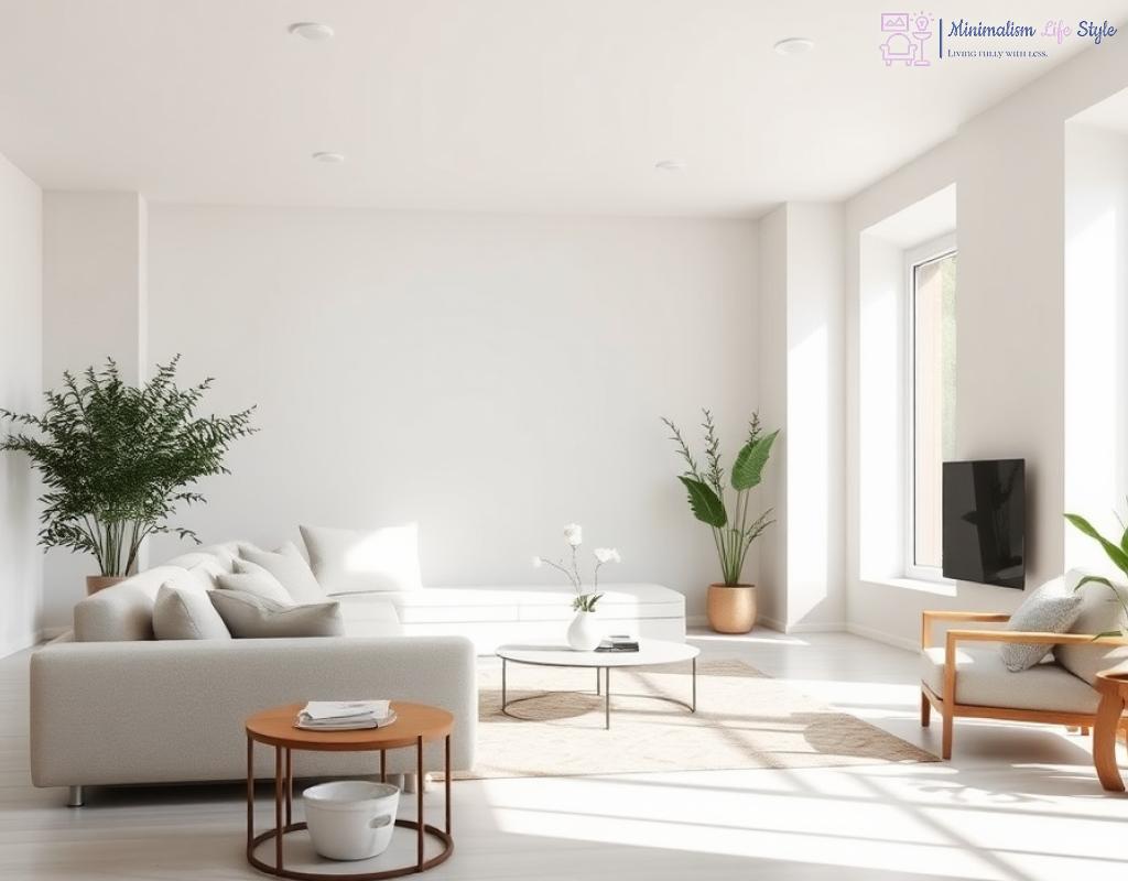
In the world of minimalism, the foundational choice of paint colors can make or break the atmosphere of your home. Neutrals offer a serene backdrop that not only enhances the spaciousness of a room but also allows for flexibility in design. Embracing the power of neutrals means embracing calmness, versatility, and timeless elegance.
When it comes to creating a minimalist sanctuary, neutrals are the unsung heroes. They serve as a blank canvas that invites personal expression without overwhelming the senses. But what exactly makes these shades so powerful? Let’s dive into the benefits of incorporating neutrals into your home’s palette.
- Timelessness: Neutral colors never go out of style and can adapt seamlessly to changing trends.
- Light Reflection: Lighter neutral shades can brighten a space, making it feel more open and airy.
- Design Flexibility: Neutrals work harmoniously with a variety of textures and colors, allowing for easy updates.
- Emotional Balance: Soft tones can promote relaxation and tranquility, ideal for creating a peaceful environment.
Building the perfect neutral base involves a thoughtful selection of hues that resonate with your personal style while maintaining a minimalist aesthetic. Here’s a simple guide to help you curate your ideal palette:
| Neutral Color | Description | Best Used In |
|---|---|---|
| White | A classic choice that embodies purity and simplicity. | Living areas, kitchens |
| Beige | A warm, inviting tone that adds comfort. | Bedrooms, dining rooms |
| Gray | A versatile shade that can bring sophistication. | Bathrooms, home offices |
| Greige | A blend of gray and beige that offers warmth and depth. | Hallways, open spaces |
By carefully selecting from this list, you can create a cohesive look that reflects your taste while embracing the minimalist ethos. Remember, the goal is to create a harmonious environment that feels curated yet effortless.
Accent Colors: Making a Bold Statement in Minimalism
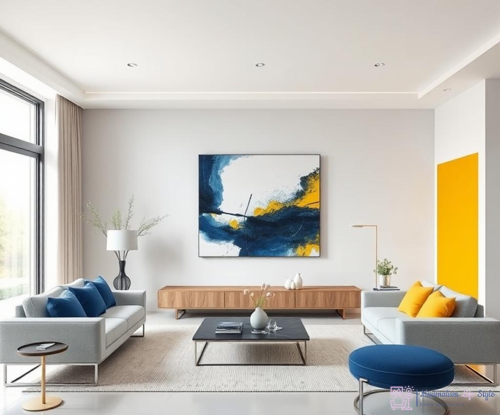
While neutrals lay the groundwork for a tranquil and sophisticated space, accent colors breathe life and personality into a minimalist home. These vibrant hues serve as striking focal points that draw the eye and can transform an otherwise understated environment into a dynamic haven of style. Choosing the right accent colors is crucial, as they can evoke emotions and set the mood without overwhelming the serene palette established by neutrals.
Accent colors are more than mere decorative choices; they play a pivotal role in enhancing the overall aesthetic of your home. When used thoughtfully, these hues can create a sense of balance and depth. Here’s how they contribute:
- Contrast: They provide a visual break from the subdued tones, creating a striking contrast that can energize a space.
- Highlighting Features: Accent colors can draw attention to architectural details or unique design elements, ensuring they don’t go unnoticed.
- Setting the Mood: Different colors evoke different feelings. A bold red can inspire passion, while a soft blue promotes tranquility.
Selecting the perfect accent colors requires a careful consideration of your existing neutral palette and the emotions you wish to convey. Here are some steps to guide your decision:
- Assess Your Space: Take a close look at the room and identify the areas that need a pop of color.
- Consider the Mood: Decide what atmosphere you want to create. Warm tones like yellow and orange can energize, while cool tones like green and blue can calm.
- Test Before Committing: Use samples and swatches to visualize how the accent color interacts with your neutrals under different lighting conditions.
- Be Bold, but Balanced: Choose one or two accent colors to maintain the minimalist ethos while still making a statement.
To help you get started on your journey to a beautifully accented minimalist home, here’s a list of popular accent colors and their emotional impacts:
- Mustard Yellow: Infuses warmth and cheerfulness.
- Deep Blue: Adds a sense of calm and sophistication.
- Soft Coral: Provides a refreshing and inviting atmosphere.
- Emerald Green: Introduces a touch of nature and tranquility.
Ultimately, accent colors are your opportunity to express individuality within a minimalist framework. By choosing the right hues, you can achieve a striking balance that transforms your home into a sanctuary of both simplicity and vibrancy.
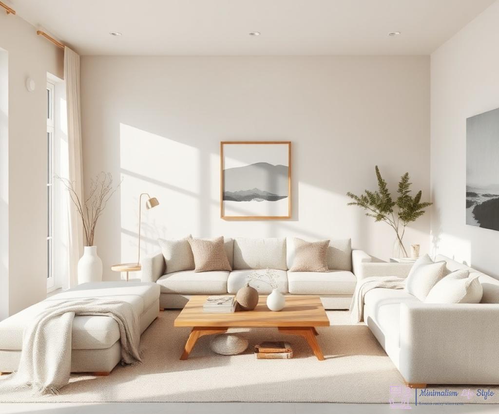
Textures and Finishes: Elevating Simple Hues
In the realm of minimalism, where simplicity reigns supreme, incorporating various textures and finishes can dramatically enhance the visual interest of your chosen hues. While neutral colors create a calming backdrop, the addition of different textures can add depth and dimension, making your space feel more inviting and dynamic. Embracing this approach allows you to maintain a minimalist aesthetic while ensuring that your home doesn’t feel flat or uninspired.
Understanding the Impact of Texture
Texture is an essential element in design that can transform the perception of color. When light interacts with different finishes, it creates shadows and highlights that change how we perceive hues throughout the day. For instance, a matte finish can soften the appearance of a color, offering a more subdued and cozy vibe, while a glossy finish can reflect light, enhancing brightness and creating a more energetic atmosphere. By thoughtfully combining textures, you elevate the simplicity of your chosen colors, creating a rich, layered environment.
Exploring Finishes: The Key to Dimension
When selecting paint finishes, it’s important to consider how they complement your color choices. A satin finish, for example, strikes a perfect balance by reflecting some light while still maintaining a soft appearance. This choice can be ideal for high-traffic areas, ensuring durability without compromising on style. In contrast, a flat finish offers a more matte look that can create an elegant and understated feel, perfect for bedrooms or serene spaces. To further amplify the beauty of your neutrals, consider using textured paint techniques, such as sponging or rag rolling, that add a unique character to the walls without overwhelming the minimalist vibe. Ultimately, choosing the right finish can enhance the emotional resonance of your space.
Layering Textures for a Cohesive Look
To achieve a cohesive aesthetic, layering different textures within the same color palette can deliver a stunning visual effect. Integrating materials like wood, metal, and textiles will provide a tangible contrast that can enhance the overall appeal of your minimalist design. For instance, pairing a smooth, painted wall with a rustic wooden bench or metallic accents can create a harmonious balance that feels both sophisticated and warm. The key is to ensure that the textures you choose work together to tell a story, inviting comfort and style into your home.
Seasonal Shifts: Adapting Your Palette Year-Round
As the seasons change, so too does the light and mood in our homes. Embracing a minimalist design ethos allows for the flexibility to adapt your space, making it feel fresh and inviting throughout the year. Understanding how to adjust your color palette in response to seasonal shifts can enhance the ambiance of your home while maintaining a cohesive aesthetic.
Each season brings its unique charm, and your color choices can reflect that natural beauty. In spring, consider soft pastels that evoke feelings of renewal, while summer might call for vibrant hues that celebrate the warmth and liveliness of the season. Autumn often inspires earthy tones, such as rust and deep greens, while winter can be a time for cooler shades or deeper colors that create a cozy, intimate atmosphere. By being mindful of these seasonal variations, you can create a home that feels aligned with nature’s rhythm.
Adapting your palette doesn’t mean a complete overhaul; rather, it’s about making thoughtful adjustments. Here are some effective strategies to keep your color scheme seasonal yet timeless:
- Layering Textures: Incorporate seasonal textiles, such as lighter fabrics in warmer months and heavier materials during colder seasons. This can add depth without needing to repaint.
- Accent Colors: Rotate your accent colors according to the season. For instance, introduce bright yellows or coral in summer, and transition to richer burgundies or deep blues as the days grow shorter.
- Nature-Inspired Hues: Draw inspiration from the colors of the season outside your window. Utilize shades found in autumn leaves or winter skies to create a seamless connection between your interior and the environment.
While it’s essential to embrace seasonal changes, ensuring a cohesive flow throughout your home is equally important. This can be achieved by selecting a core neutral palette that remains consistent year-round, allowing for seasonal accents to shine. By establishing a base of timeless hues, you can effortlessly transition between the vibrancy of summer and the calm of winter without losing the minimalist charm that defines your space. This approach not only elevates your home’s aesthetic but also simplifies the decorating process, making it a rewarding and enjoyable endeavor.
Lighting Matters: How to Choose Colors Wisely
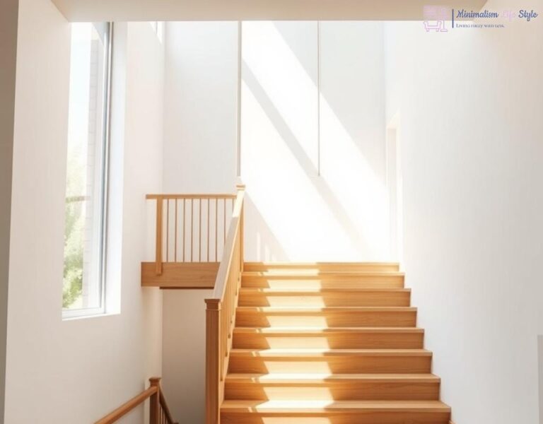
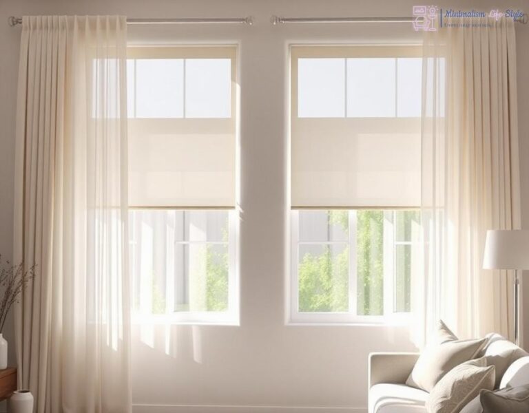
When it comes to selecting paint colors for a minimalist home, understanding the role of lighting is paramount. Light has the power to transform your space, impacting how colors are perceived throughout the day. The interplay between natural and artificial light can create a dynamic relationship with the hues you’ve chosen, making it essential to choose wisely to achieve the desired ambiance.
The intensity and direction of natural light can dramatically alter the way a color appears on your walls. Rooms that receive ample sunlight will often reflect this brightness, making lighter tones appear even more vibrant. Conversely, in spaces that lack direct sunlight, colors may appear duller or darker than intended. To ensure your colors resonate well within your space, it’s crucial to observe how natural light flows throughout the day. This means observing your chosen hues in different lighting conditions — early morning, midday, and late afternoon. You will likely find that neutrals can take on varying tones, enhancing their versatility and timelessness.
While natural light plays a vital role, artificial lighting can significantly influence how colors are perceived in your home during the evening. Different types of bulbs emit varying color temperatures that can warm or cool a room’s atmosphere. For example, incandescent bulbs emit a warm glow that can enhance beige or warm gray tones, adding a cozy feel. On the other hand, fluorescent lights tend to cast a cooler light, which can sometimes clash with warmer hues. To achieve a balanced look, consider incorporating multiple light sources and experimenting with different bulbs to find the perfect match for your color palette. It’s often recommended to test your colors under both natural and artificial light before making a final decision.
Ultimately, creating a harmonious relationship between paint colors and lighting is essential in achieving a cohesive minimalist home. Think about how different colors can complement the existing light sources within your space. Soft whites and light grays can serve as excellent neutrals, providing a clean slate that can adapt to varying light conditions. Moreover, incorporating reflective surfaces, such as mirrors or glossy finishes, can help bounce light around the room, enhancing the overall brightness and making colors pop. This thoughtful approach will not only elevate the aesthetic quality of your home but also foster an environment that feels both calming and inviting.